MapLab: No Map Is an Island
A biweekly tour of the ever-expanding cartographic landscape.
Welcome to the Valentine’s Day edition of MapLab. Sign up to receive this newsletter in your inbox here.
Compass points: Queer love, on the map
Maps leave out more than they include. For better or worse, that’s what makes them so seductive: Maps simplify and order the chaos of reality.
So when a map reveals something about a place or group of people often hidden or silenced, it can be pretty empowering for whoever’s on the map—and threatening for those left off.
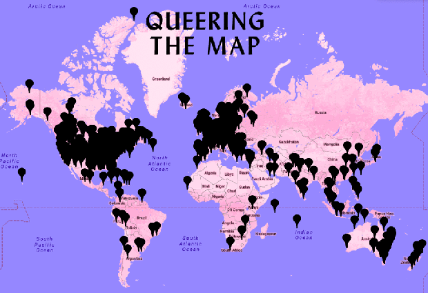
That may be part of the story with Queering the Map, a new interactive mapping project by Lucas LaRochelle, a 22-year old designer and student at Concordia University in Montréal. Anonymous users drop pins and write messages across a pink and purple global terrain, locating the moments that shaped their queer identities.
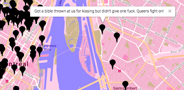
In public parks, college campuses, dive bars, waterfronts, parking garages, and beyond, “entries run the gamut from the romantic and sexual, to the tragic and transformative,” writes Alastair Boone, who co-reported on the map with Martín Echenique for CityLab this week. In a synopsis for MapLab readers, Boone continues:
The project’s goal is to chart the queer experience of physical space onto cyberspace, so that users can engage with each other’s stories freely. As queer spaces are shuttered or decentralized in cities around the world, the map has the potential to document generations of queer history.
“As queer life becomes increasingly less centered around specific neighborhoods [and buildings], notions of ‘queer spaces’ become more abstract,” LaRochelle writes on their website. “The intent of the Queering the Map project is to ‘queer’ as much space as possible… to mark moments of queerness wherever they occur.”
First developed about a year ago, the map held more than 5,000 entries by February 8, 2018. Then it got hacked, with a forest of pro-Trump pin drops and messages popping up along the U.S. east coast. Now the map is being rebuilt more securely by a team of volunteer coders. The stakes are high.
“As a young queer person growing up in rural Ontario, where for a very long time I felt like I was the only queer person, I would say the internet saved my life, in terms of seeing representations of queerness… and knowing that there were other people in the world that had similar experiences,” LaRochelle told CityLab.
More map love: Jeff Ferzoco’s OUTgoing NYC maps historic queer spaces across the Big Apple.
Startographer of the week: Heartbeat of a city
Topi Tjukanov, a Finnish geographer and geospatial hobbyist, tweeted out a very special Valentine’s Day visualization: the “heartbeats” of nine American cities. Using traffic data from HERE maps, Tjukanov mapped each city’s average traffic volumes, in red and pink isochrone, over a 24-hour period.
Can you identify each city? Email me your best guesses. I’ll tell you if you’re correct.
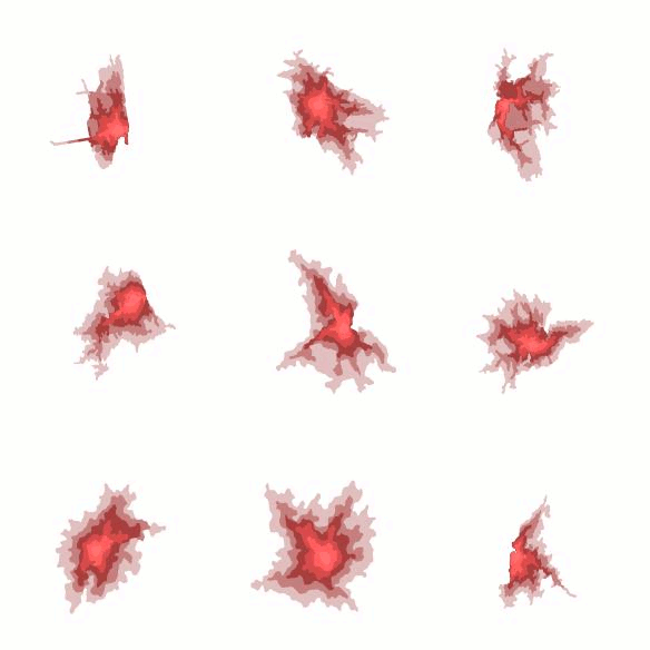
Bonus: here’s Atlas Obscura on why isochrone is enjoying a renaissance in maps. (I’d call it the ombré of geospatial design.)
Mappy links
Play on, Mozartstraße: What street names reveal about Germany’s past. ♦ Dangers of non-inclusive mapping: Google Maps is sending women seeking abortions to pro-life pregnancy centers instead of legitimate clinics. ♦ When it comes to mapping transit service, a “gap” is all in the eye of the beholder. ♦ Ratf**ked is a word for it: The secret history of the map that “destroyed Pennsylvania politics.” ♦ One idea: Amanda Holt, piano teacher by day, cartographer by night, has redrawn the Keystone State’s congressional district map. ♦ Pump that Gucci Gang: the most popular songs in 3,000 places around the world.
Mappy poem
Excerpted from the uncollected works of Rainer Maria Rilke:
Exposed on the mountains of the heart.
See, how small there,
see: the last hamlet of words, and higher,
and yet so small, a last
homestead of feeling. Do you recognize it?
Share MapLab with a loved one. Sign up here.
????????????????
Laura